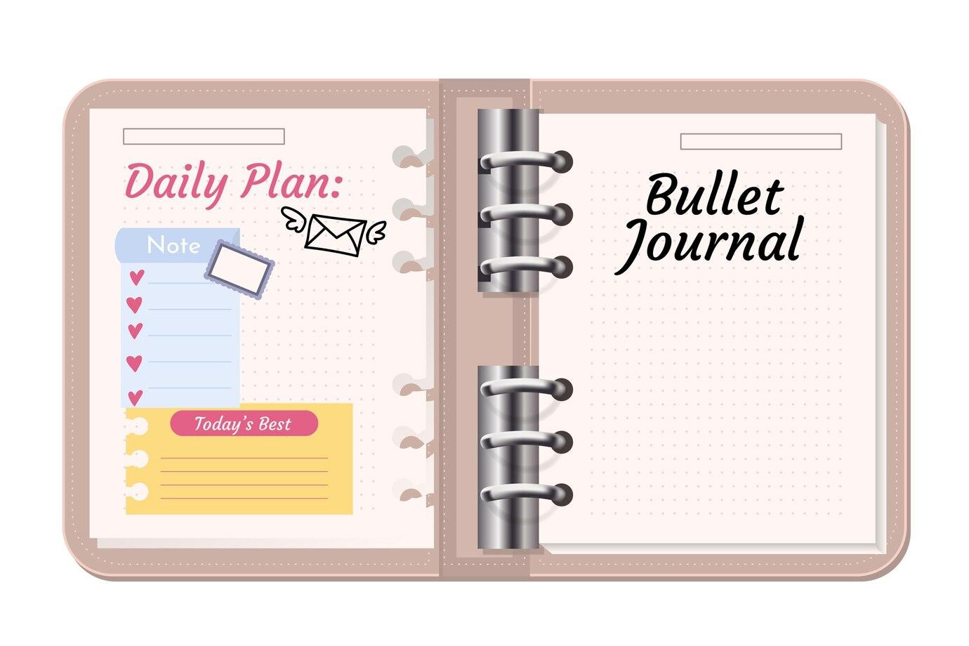
Your bullet journal cover is a canvas waiting to tell a story. Font and color design form the alchemical blend that breathes life into this canvas, turning it into a reflection of your inner world—a unique amalgamation of style, passion, and purpose.
Harmonizing Fonts for Impact
Fonts carry an unspoken language. Each stroke and curve communicates a different tone. Utilize contrast wisely—combine a bold, attention-grabbing font for the title with a subtle, easy-to-read font for supporting text. Balance between elegance and readability, allowing your fonts to sing in unison.
Crafting with Color Psychology
Colors wield immense power in shaping emotions. Delve into the psychology behind colors to invoke the desired sentiments. Earthy tones convey stability and groundedness, while vibrant hues symbolize energy and enthusiasm. Blend shades thoughtfully, creating a visual symphony that resonates with your journal’s purpose.
Conclusion
The marriage of fonts and colors is akin to a beautiful dance—the harmony between them creates a melody that sets the tone for your bullet journal‘s journey. Through careful selection and deliberate design, your notebook cover becomes more than just a visual; it becomes a reflection of your intentions and aspirations.